Color Trend 2026: Southwest Pottery 048
Discover the Beauty of Color Trend 2026: Southwest Pottery 048
What is Southwest Pottery 048? Decoding Its Special Allure
Southwest Pottery 048, also known as SP048, is a warm terracotta hue, reminiscent of the artisanal pottery from the American Southwest. It is not just a color, but a story, a cultural heritage. The allure of SP048 comes from its intimacy and rustic simplicity, bringing a cozy and relaxing feeling to any space. This is a neutral color that is far from boring, with the flexibility to combine with many different design styles.
Inspiration from the Southwest: The Story Behind the Color
SP048 is directly inspired by the wild, majestic beauty of the American Southwest. From the vibrant red deserts and magnificent rock canyons to the traditional pottery villages, all have created a unique and inspiring color palette. This warm terracotta color is reminiscent not only of nature, but also of long-standing cultural values, and the endurance and resilience of the people there. It brings a deep sense of connection to the past and to nature.
Applying Color Trend 2026 Southwest Pottery 048 in Design
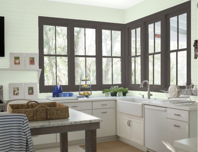
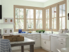
Combining Southwest Pottery 048 in Living Spaces: Suggestions and Ideas
SP048 is an excellent choice for bringing warmth and intimacy to a living space. You can use it for:
-
Wall paint: An SP048 wall will create a warm and unique accent for the living room or bedroom.
-
Furniture: Sofas, rugs, and curtains in the SP048 color will bring comfort and relaxation.
-
Accessories: Pottery, pictures, and throw pillows in SP048 will be subtle accents for the space.
Some combination ideas:
-
Bohemian Style: Combine SP048 with other natural colors like green, wood brown, and tribal patterns.
-
Minimalism Style: Use SP048 as an accent on a white or gray background, creating balance and warmth.
-
Rustic Style: Combine SP048 with raw wood, natural stone, and recycled materials.
Southwest Pottery 048 in Fashion: Creating a Personal Accent
In the fashion industry, SP048 is a color that easily creates a personal accent and unique style. A suede jacket in SP048 would be a trendy choice for autumn-winter. Or, a leather handbag in SP048 will be the perfect accent for a simple outfit. SP048 also pairs well with copper or silver jewelry, creating a classic and sophisticated look.
Southwest Pottery 048 in Graphic Design: Bringing a Modern Breath
In graphic design, SP048 can be used to create warm, approachable, and professional designs. It is suitable for many different types of design, from logos and websites to advertising banners. SP048 can pair well with modern sans-serif fonts or classic serif fonts, depending on the design style you are aiming for. The warmth of this color helps enhance aesthetic appeal and the ability to connect emotionally with the viewer.
Why is Southwest Pottery 048 the Color Trend of 2026?
Color Psychology Analysis: How Does Southwest Pottery 048 Impact Emotions?
SP048 is a highly connective color, evoking feelings of warmth, safety, and stability. It has the ability to soothe moods, reduce stress, and create a relaxing space. This color is also related to creativity, innovation, and a connection with nature. In the modern social context, as people increasingly seek balance and connection with themselves, SP048 becomes an ideal choice to bring peace and harmony.
The Rise of Natural Styles: Southwest Pottery 048 Blends into the General Trend
The 2026 design trend is witnessing a strong resurgence of natural style, with a preference for organic materials, earth tones, and nature-inspired patterns. SP048 fits perfectly into this trend, offering a rustic, authentic, and intimate beauty. It reflects the human desire to live in a green, clean, and healthy space, while also connecting with traditional cultural values.
Advice When Using Color Trend 2026 Southwest Pottery 048

Smart Color Pairing with Southwest Pottery 048
To use SP048 effectively, you need to pay attention to color pairing. Here are some suggestions:
-
Combine with neutral colors: White, gray, and beige are safe and effective choices to highlight SP048.
-
Combine with natural colors: Green, blue, and light yellow will create a harmonious and relaxing space.
-
Use contrasting colors: Turquoise, charcoal purple can create impressive accents.
Suggested Color Palette:
| Main Color | Accent 1 | Accent 2 | Style |
| Southwest Pottery 048 | Creamy White | Light Green | Natural |
| Southwest Pottery 048 | Light Gray | Mustard Yellow | Modern |
| Southwest Pottery 048 | Wood Brown | Turquoise | Bohemian |
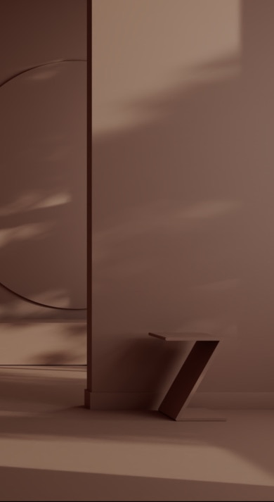
Notes on Light and Space When Using Southwest Pottery 048
Light plays an important role in expressing the beauty of SP048. In a space with ample natural light, SP048 will become warmer and more vibrant. In a low-light space, you should use additional lighting to enhance brightness and avoid a gloomy feeling. Additionally, SP048 can also make a space feel smaller. Therefore, you should use it sparingly, especially in small, narrow spaces. Use lighting effects and coordinate with lighter colors to create a feeling of airiness and spaciousness.